A new blog helping you do some basic data processing in R
To begin at the beginning: what is R? It’s an open source (basically meaning free to use) statistics program. We use R to process and manipulate data, to create figures and plots, and to run statistical tests. R is fairly straightforward to use and extremely powerful. You can create tables and graphs for documents that are reproducible and in which your process is transparent. Unlike making plots in Excel where the processing is usually unclear. Additionally, the code to change all aspects of the graph – colours, fonts and text sizes etc. are straightforward compared to Excel.
In this blog we will look at how to display a time series – a type of graph that shows you the passage of time on the x-axis (that runs along the bottom) and some variable you are interested in on the y-axis (that runs up the side). Maybe that variable is temperature, harvest yield, bacterial colony counts or something else. As long as it is a number, we can create a time series graph.
Getting hold of R, the stats package
First things first, though – you will need to set up R. You will probably prefer to use a cloud version https://posit.cloud/. The cloud version is less complex to manage and will work out of the box. Alternatively get R for your desktop. Go to this website: https://posit.co/download/rstudio-desktop/ and download R. I then recommend you use RStudio to do your programming which can be downloaded from the same location. The desktop version can be a bit tricky to sort out, which is why the cloud version is so neat.
RStudio is an IDE – an Integrated Development Environment. The IDE allows you to see all the important information relating to your code (what variables you’ve set up, how your graphs look, what errors there are in your code etc).
Once you’ve got setup, it’s time to write your first bit of code. Use hashes in the script to ‘hide’ your text from R – in this way you can write comments in your code to help the reader understand what’s going on. I recommend you include 4 pieces of information at the start of each new script (i.e. a program).
# 1. The purpose of the script, any useful information about data sources etc
# 2. The author of the script
# 3. The date you wrote the script and
# 4. The version of R that you used for the script
The next thing to do is to call the libraries you want to use. These libraries contain instructions to do specfic things. Here we’ll use the tidyverse library that allows us to manipulate data – you can perform calculations, summarise information, change the way variables work and so on. Tidyverse also contains within it the ggplot2 library that is great for plotting data. To install a library you don’t currently have, you need to execute the install.packages(“tidyverse”) command in the Console. Type install.packages(“tidyverse”) into the bottom right hand region of your RStudio app and hit enter.
We can now start creating a script (which is a collection of code you will execute all together rather than using the console which will execute code one line at a time as you write it in). I have included the comments and the command to use the tidyverse. To run the code place the cursor on the line you wish to run in your script and hit ctrl-enter, or the run command in the toolbar at the top.
# Create a time series in R
# Author: Jim Stevens
# 16/02/24
# Version 4.3.2

library(tidyverse)
## ── Attaching core tidyverse packages ──────────────────────── tidyverse 2.0.0 ──
## ✔ dplyr 1.1.4 ✔ readr 2.1.5
## ✔ forcats 1.0.0 ✔ stringr 1.5.1
## ✔ ggplot2 3.4.4 ✔ tibble 3.2.1
## ✔ lubridate 1.9.3 ✔ tidyr 1.3.1
## ✔ purrr 1.0.2
## ── Conflicts ────────────────────────────────────────── tidyverse_conflicts() ──
## ✖ dplyr::filter() masks stats::filter()
## ✖ dplyr::lag() masks stats::lag()
## ℹ Use the conflicted package (<http://conflicted.r-lib.org/>) to force all conflicts to become errors# now we create some data
Value <- c(0,1,1,2,3,5,8,13,21,34,55,89) # a fibonacci sequence
Time <- c(0,1,2,3,4,5,6,7,8,9,10,11) # say, an observation every minute
df <- as.data.frame(cbind(Time,Value))
df## Time Value
## 1 0 0
## 2 1 1
## 3 2 1
## 4 3 2
## 5 4 3
## 6 5 5
## 7 6 8
## 8 7 13
## 9 8 21
## 10 9 34
## 11 10 55
## 12 11 89We’ve now created a dataframe, called df. The dataframe is a type of object in R which makes it easy for us to manipulate or plot the data. You can see for each timepoint we have a value.
Use R to display a time series
In the next phase, we’ll create a plot (as they’re called in R), a graph or even chart (if you’re one of those financial types) – they are all the same thing.
plot1 <- ggplot(df,aes(x=Time,y=Value))+
  geom_point()
plot1
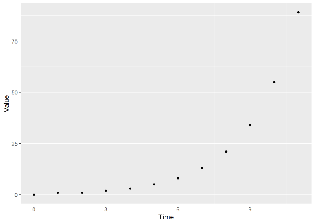
At the moment, this plot, which I’ve called plot1 is really basic. Let me take you through what’s happened:
1. We create an object called plot1
2. we assign the plot to plot1. We create the plot with the command ggplot
3. ggplot needs to know
– The dataframe to use to put together the plot: in this case, df
– The aesthetics – ‘aes’ – to use. We specify what goes on the x and y axes. We can also specify colours, and so on.
– We tell ggplot what sort of plot we want. In this case, a scatter plot ’geom_point()’. We could alternately have a line plot (geom_line()) or any number of different other types of plot.
Let’s now make the figure more attractive – we can take out the gridlines, change the point colour, make the axis labels more-readable and so on.
plot2 <- ggplot(df,aes(x=Time,y=Value)) +
  geom_point(size=2,colour="red") + # specify the colour and size of the points
  theme_bw() + # creates a simple, clear plot, but leaves some gridlines in
  theme(panel.grid=element_blank())+ #...so remove the gridlines
  scale_x_continuous(limits = c(0, 12), breaks = seq(0, 12, by = 2)) + # create a bespoke scale
  xlab("Time (minutes)")+ # relabel the x-axis
  ylab("Number of organisms") # relabel the y-axis
plot2 # print (ie display) the plot
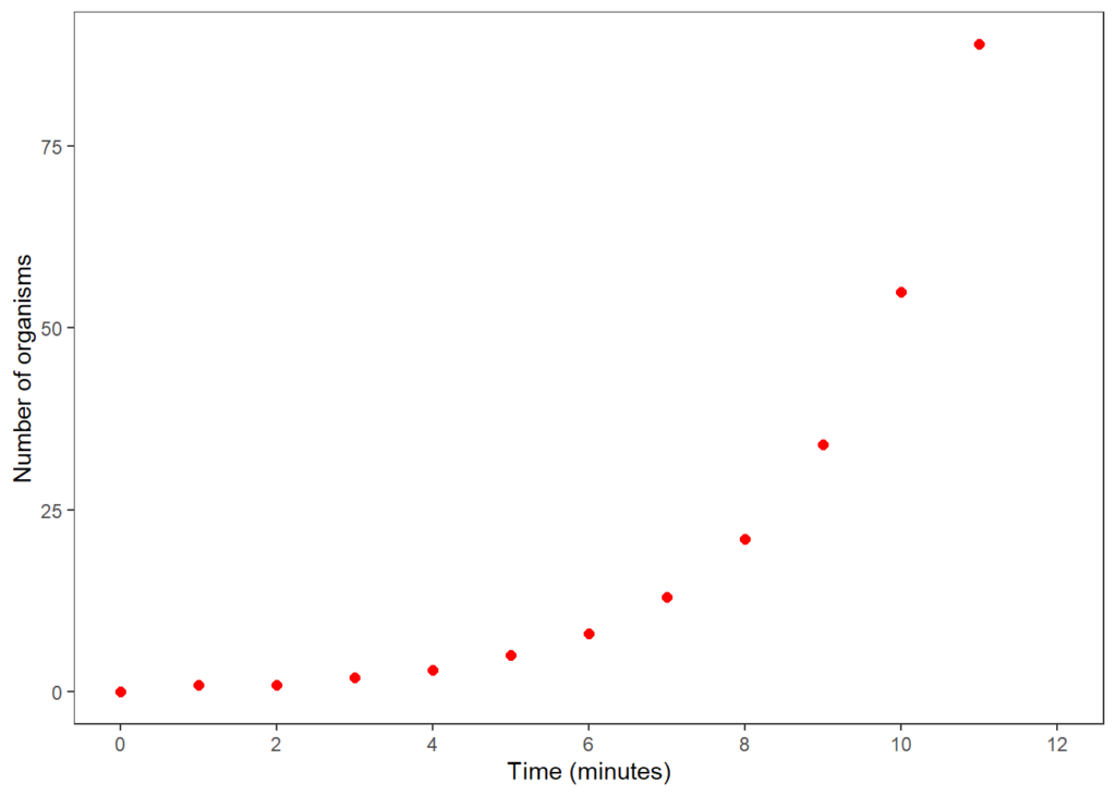
That’s it for now. See if you can reproduce this figure by yourself. We’ll be back with more ideas for simple plots including making boxplots, violin plots, analysing data and creating linear models for data in the coming weeks. If you feel the need for some training to get you started in R, then contact us on hello@innophyte.co.uk or visit the website. We’ve used it for all our published articles as well as preparing visualisations for presentations, blog posts, social media graphs and others.

Dr. Jim Stevens
Senior Innovation Consultant
Hello, I am Jim, one of the consultants at InnoPhyte Consulting! My background is spanning from wine trade, finance, and plant science. I can support you with with grant writing, experimental design, data analysis and much more.
If you need to pick my brains, feel free to get in touch at jim@innophyte.co.uk
Science Support
Data Analysis
Data Visualisation
Project Manager
Grant Science